
DESCRIPTION
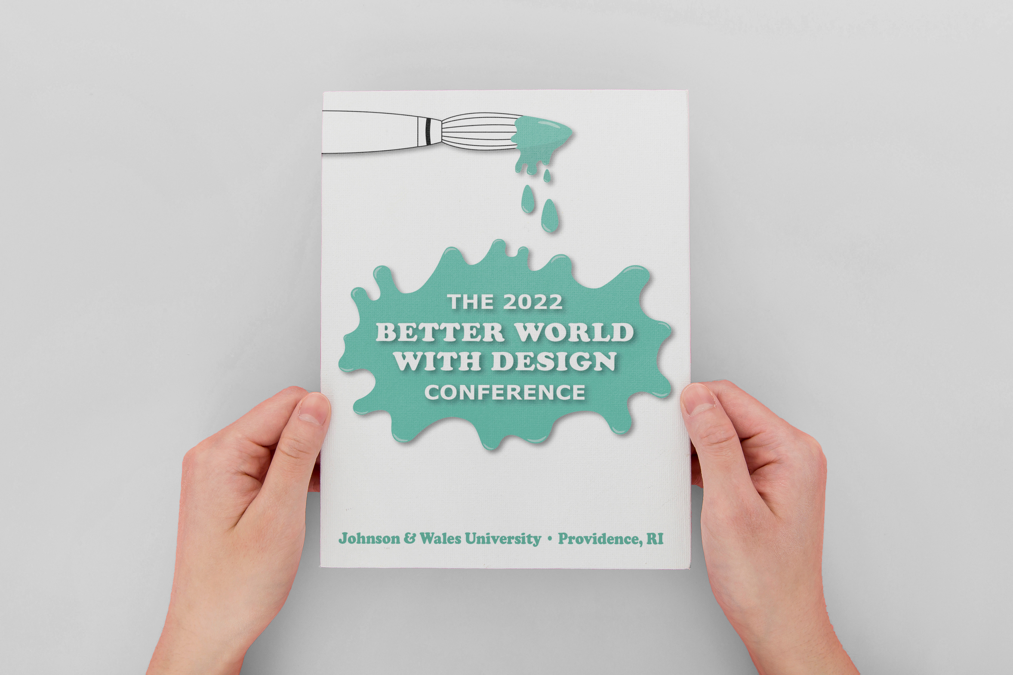
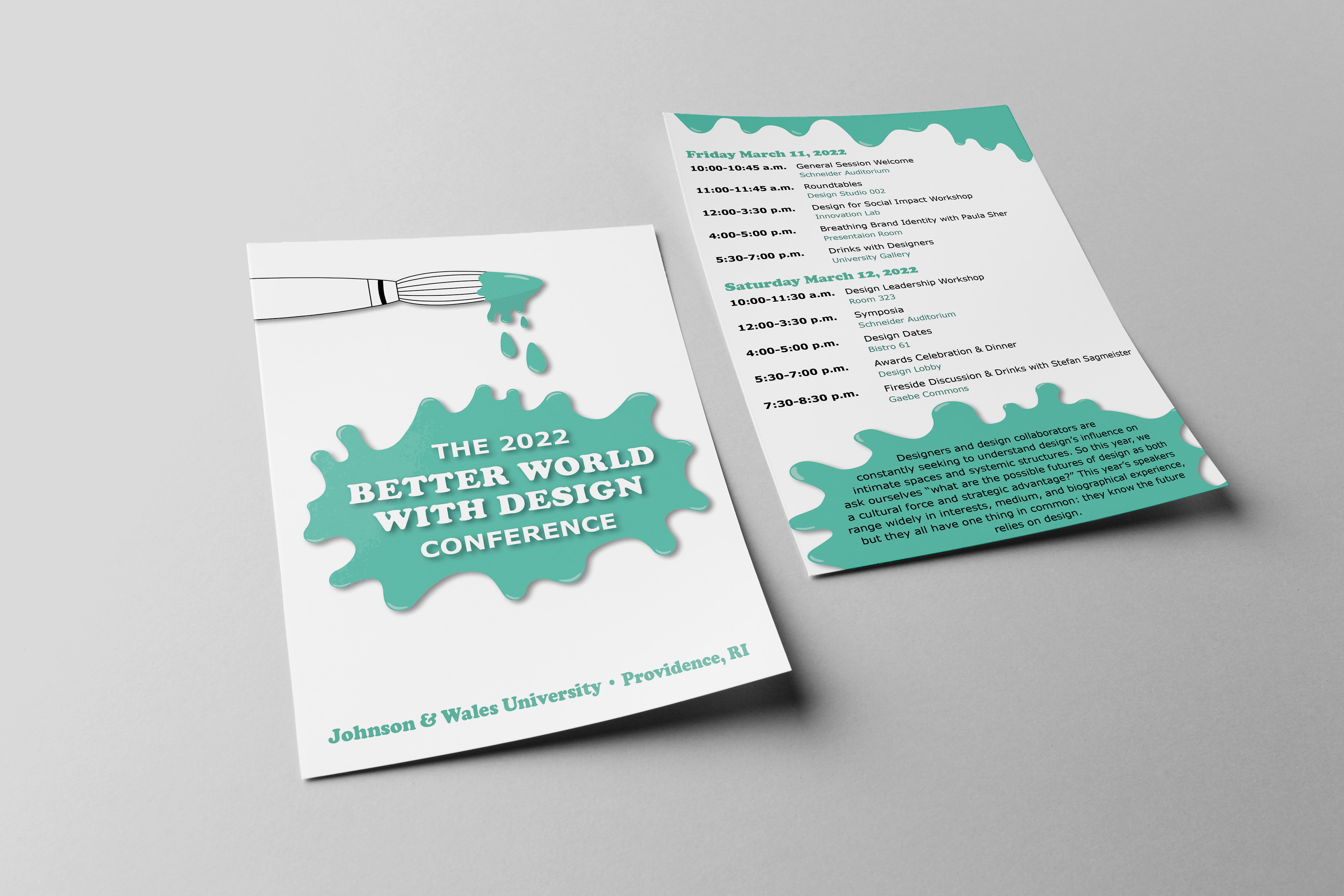
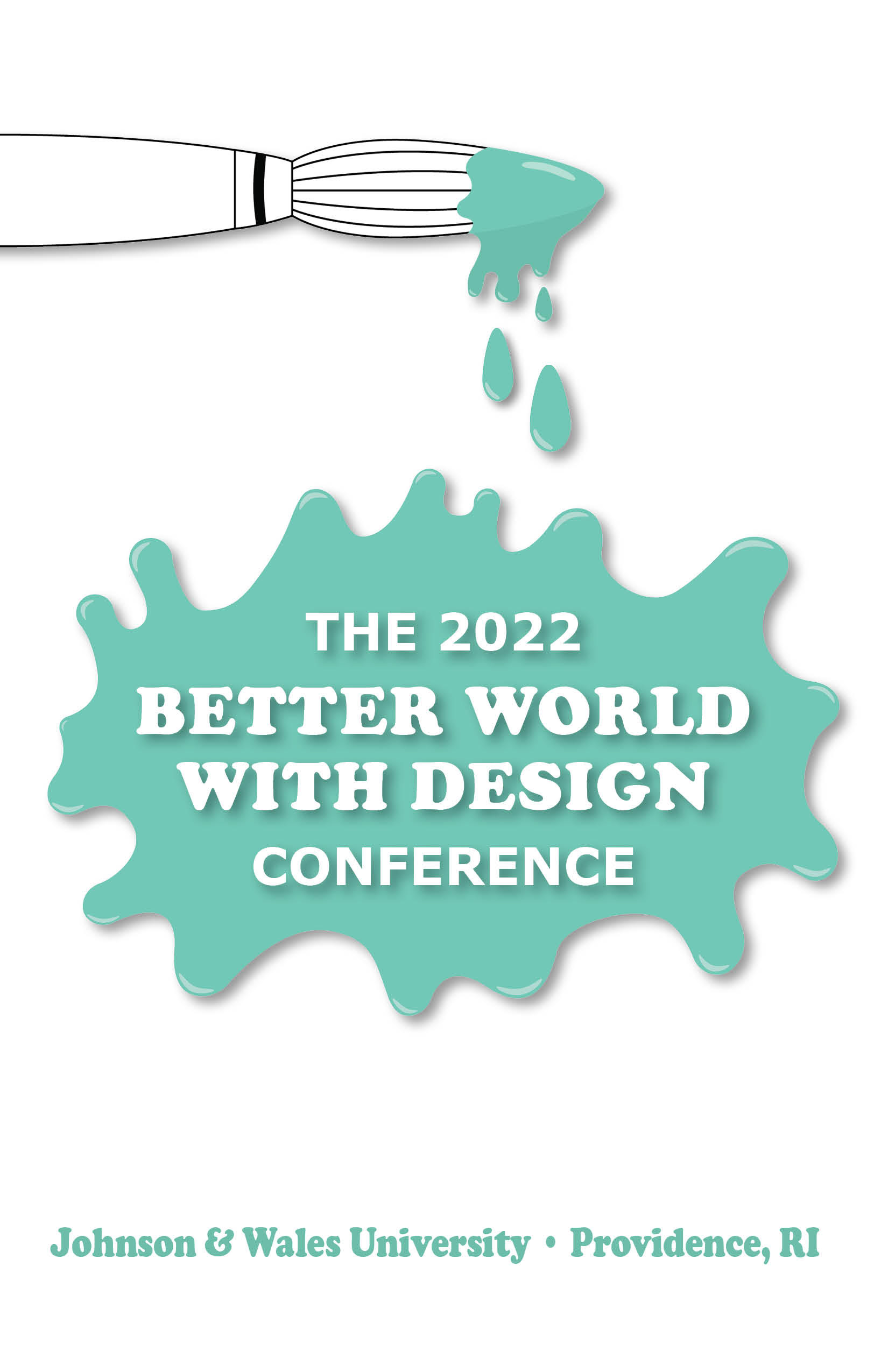
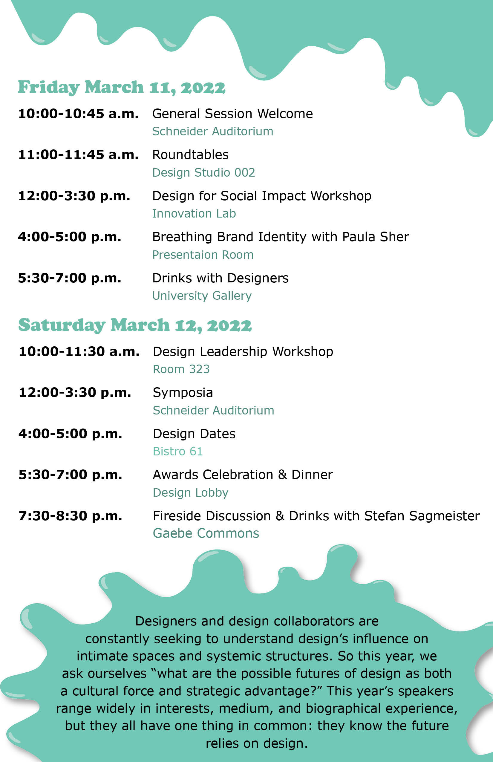
For this project, I was responsible for designing a 5.5” x 8.5” double-sided event program for an upcoming hypothetical design conference. I was provided with all the written content and information that was to be used in the event program and it was up to me to format the given information using a visual and typographic hierarchy.
STEP ONE: MOODBOARD
The first step in this process was creating a moodboard that gave a few examples of the designs I was looking to create. For my concept, I chose to keep the design simple and easy to read by only using one color and two different fonts along with some simple line drawings. I decided on this to keep the program fast and easy to read and understand while also being fun to look at. The teal color came to mind to use as to me its a creative and interesting color that would go cohesively with the over vibes I was going for. The fonts were also chosen to be easy to read and understand quickly when looked at.
STEP TWO: SKETCHES
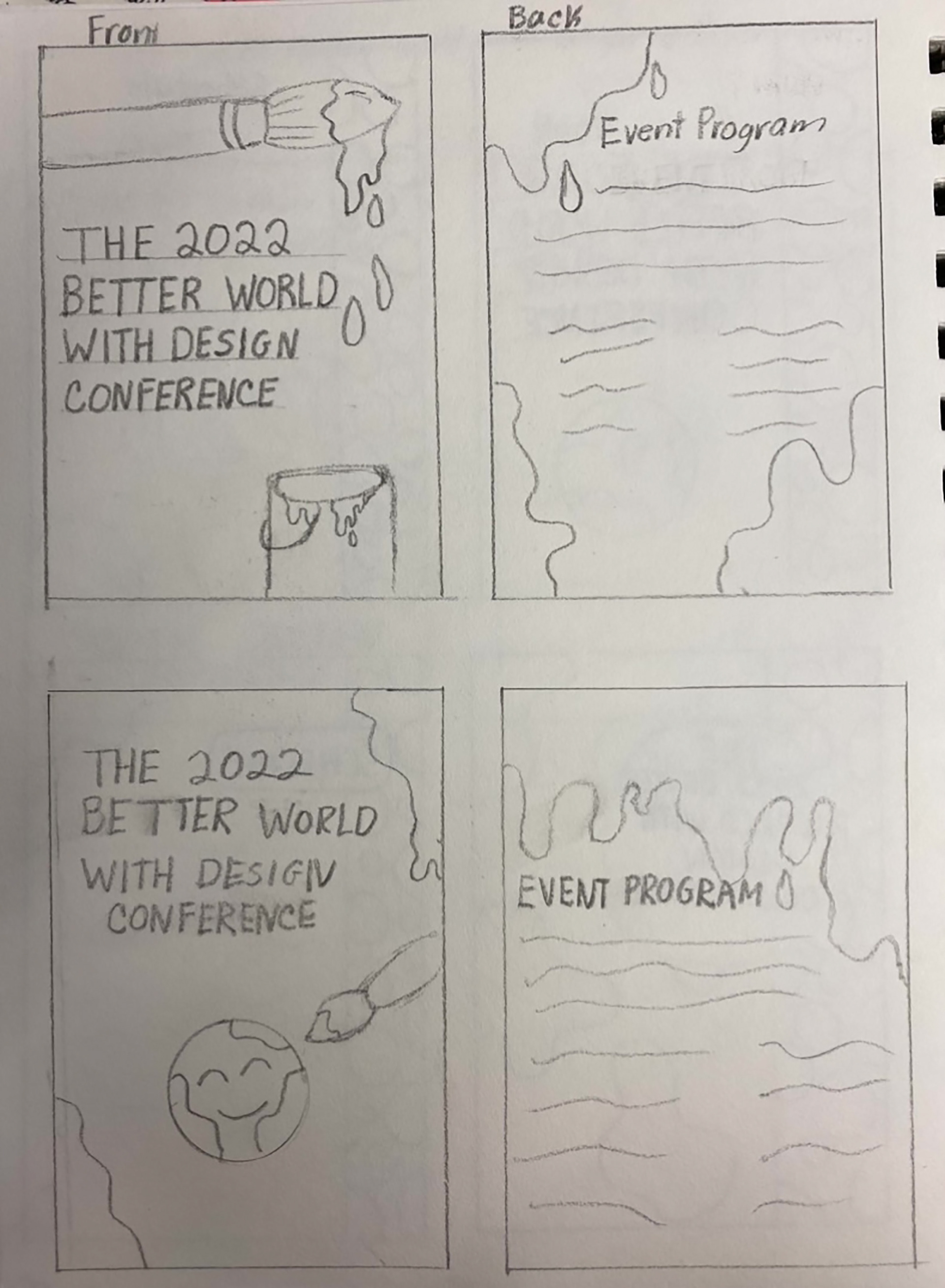
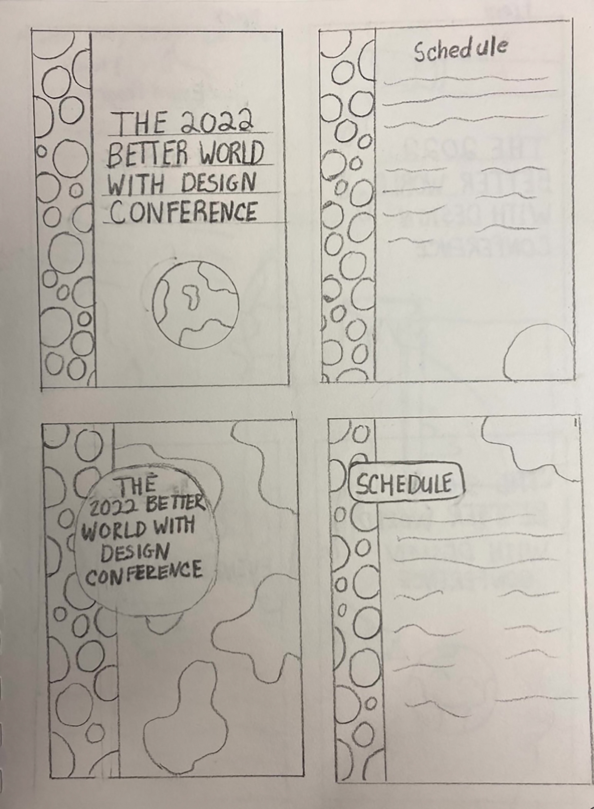
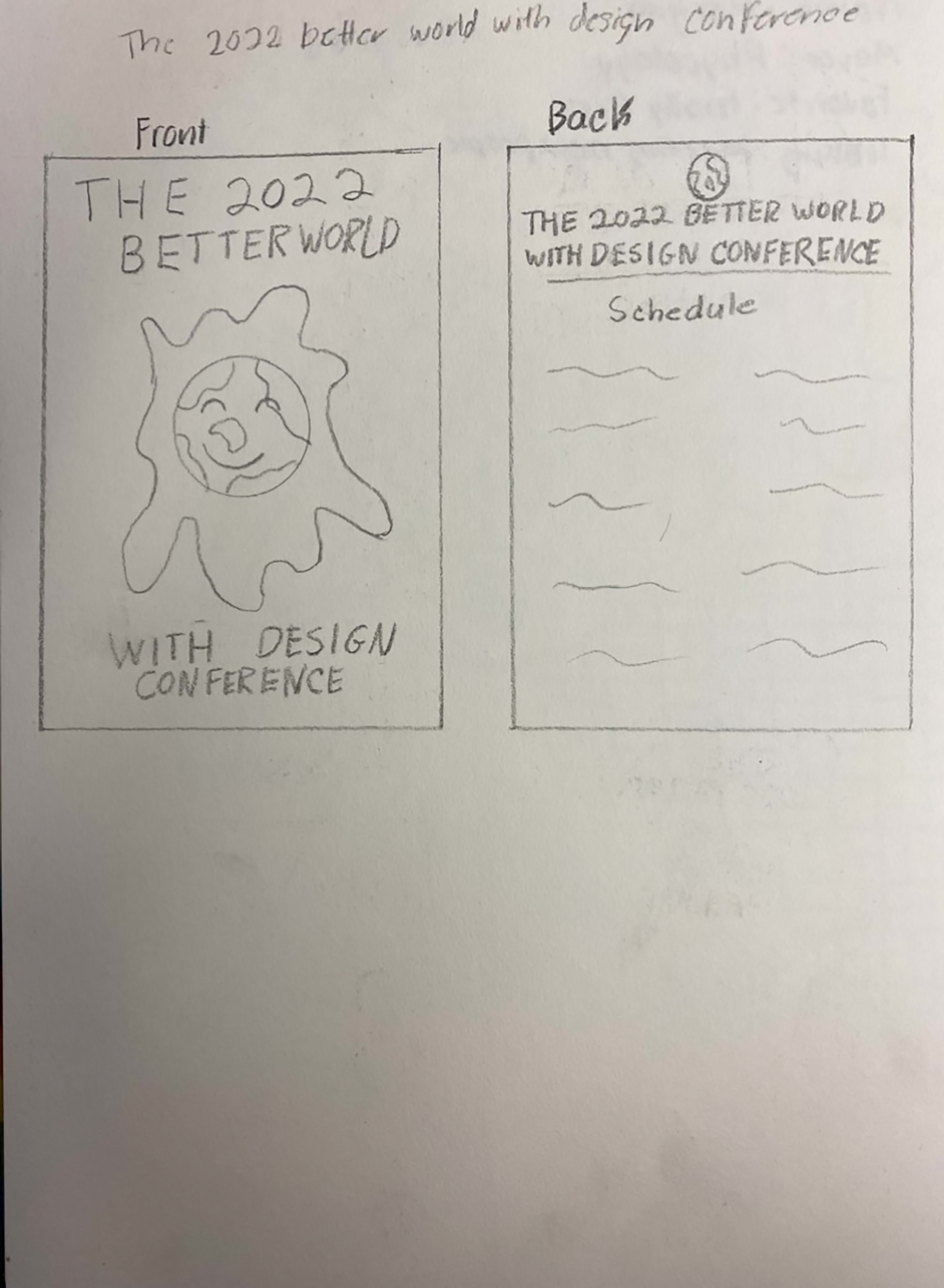
Sketches are the next step in this assignment. They are used to get my ideas out of my head and onto paper. It makes it easy to move forward with creating a digital design.
STEP THREE: FIRST DRAFT
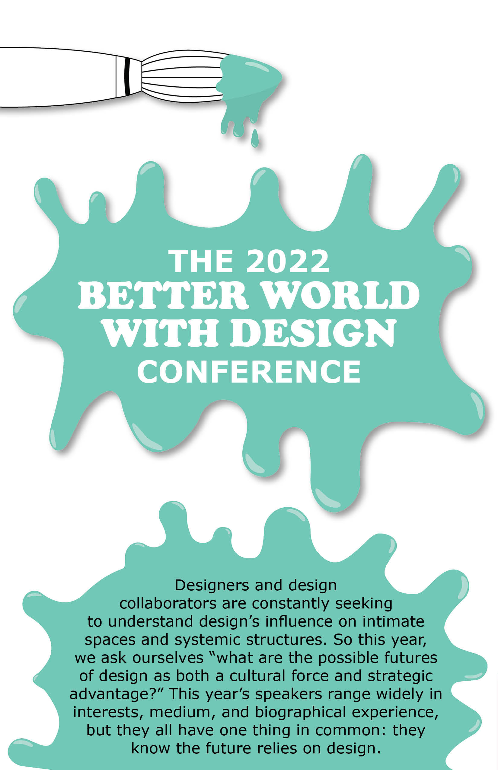
After creating sketches for a potential design, I had to choose which design would work best and digitalize it. Creating the first design.
STEP FOUR: SECOND DESIGNS
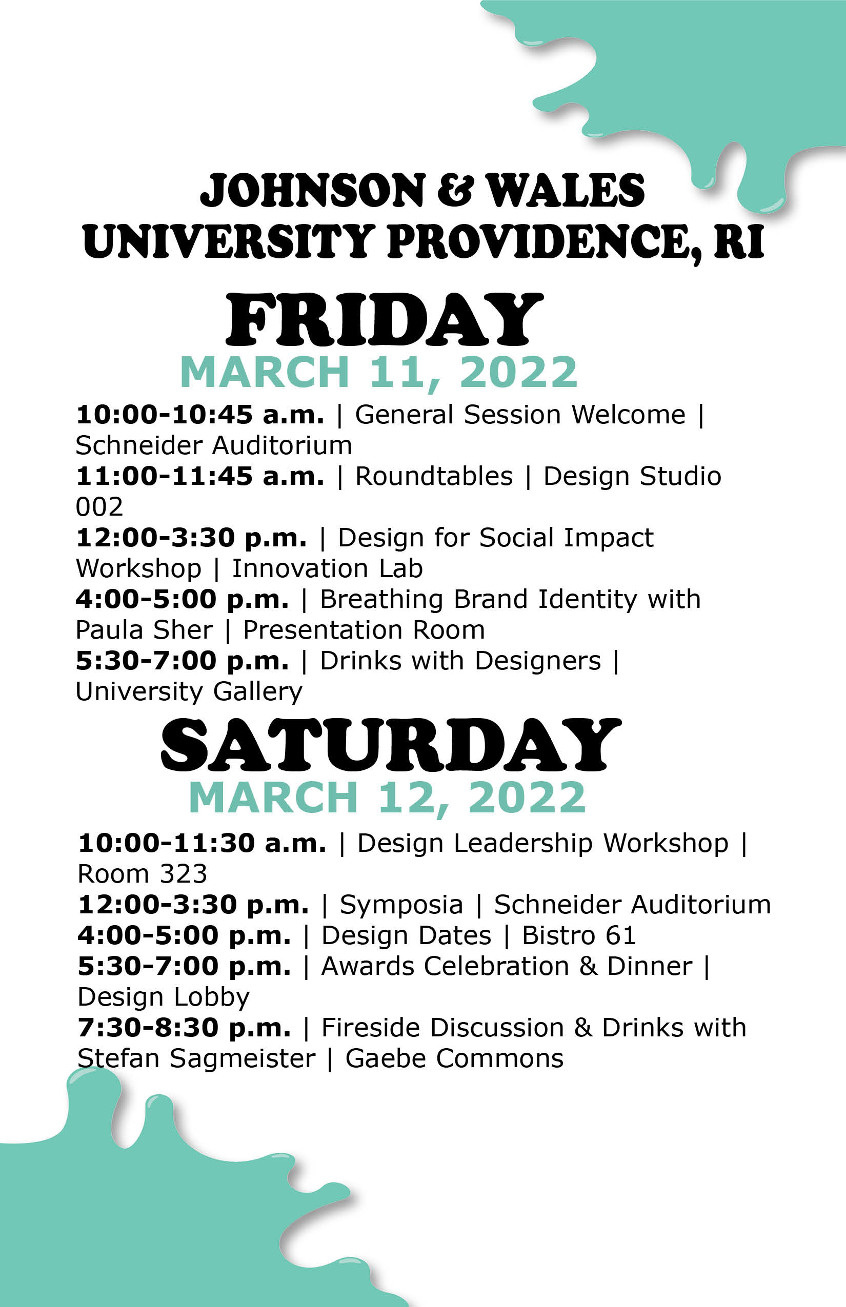
The next step in this process was making edits to the first design to improve it. The main design changes I focused on were fixing the typography. Decreasing the header size and the overall layout of the type. I also moved the informational paragraph to the backside of the program so the front cover stands out a lot more.
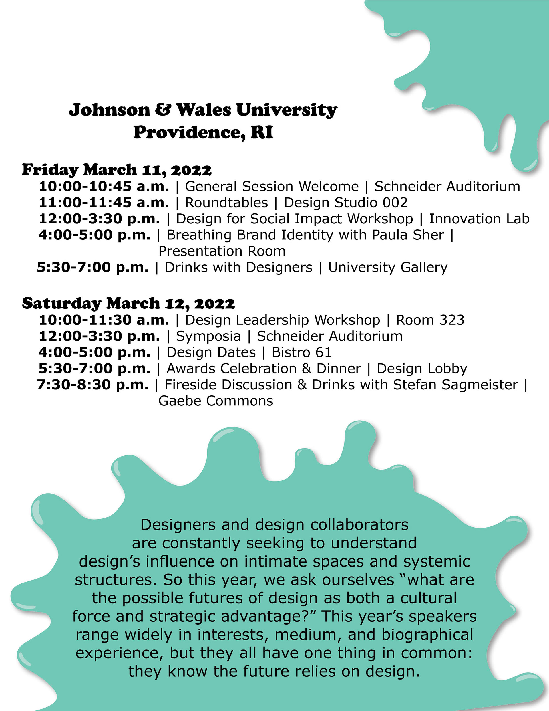
STEP FIVE: MORE EDITS
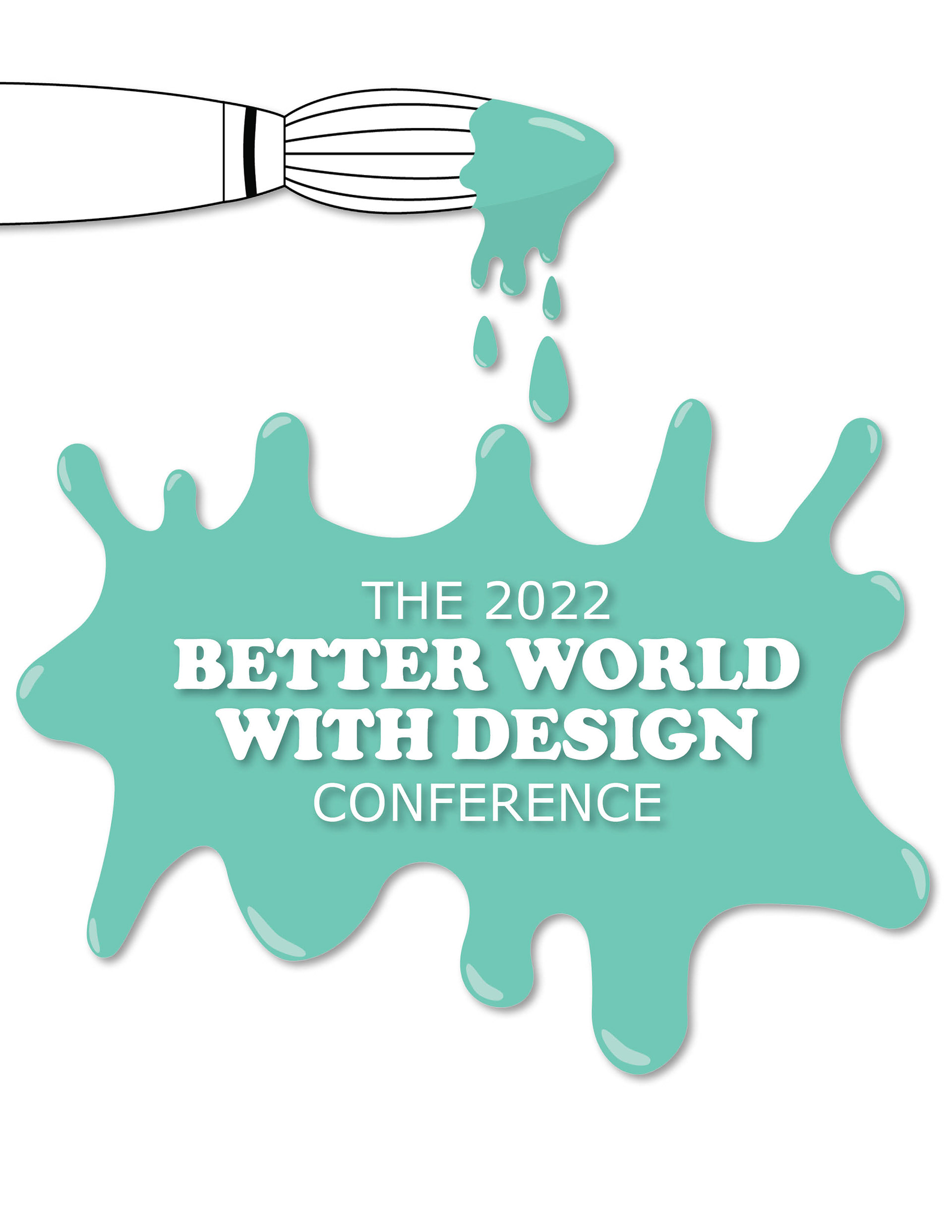
I continued to work on the program to make more edits to improve the design. I again worked on the typography as well as added a few more design elements like the paint drips at the top of the page.


STEP SIX: FINAL DRAFT
STEP EIGHT: MOCKUPS
