DESCRIPTION
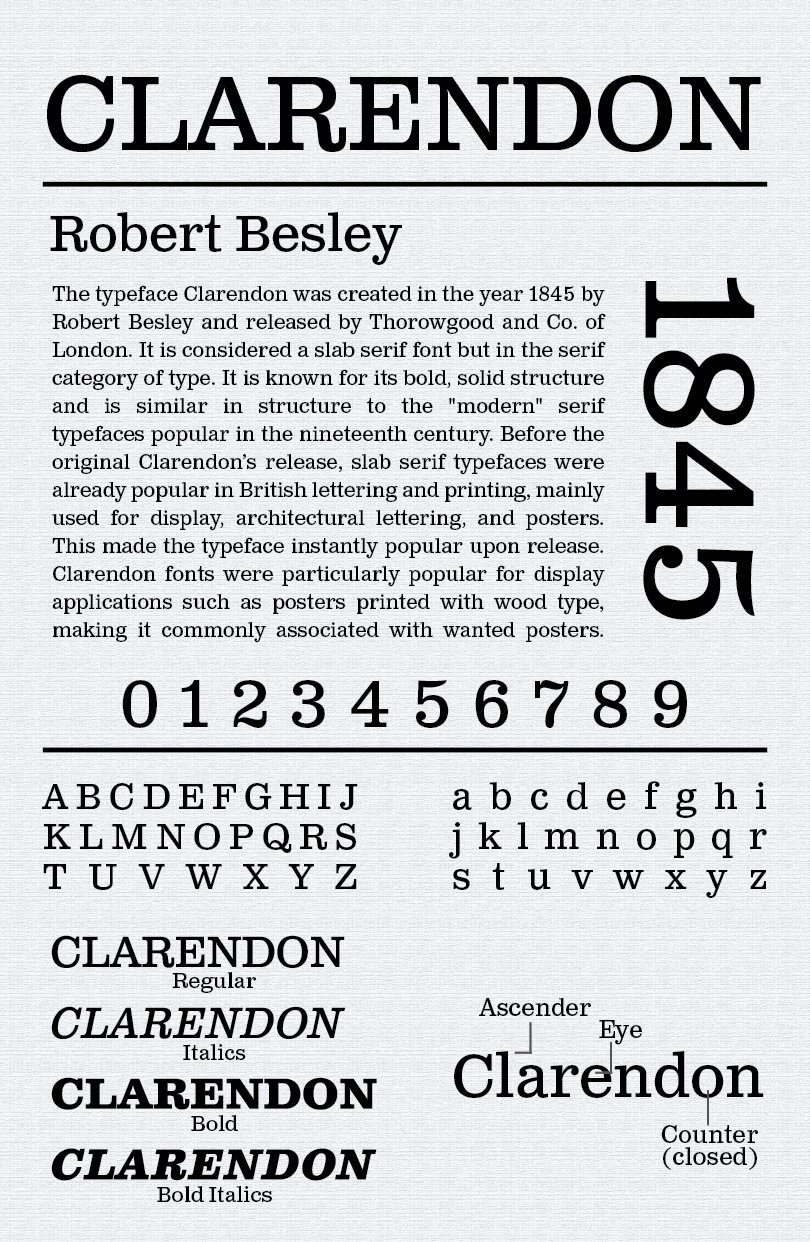
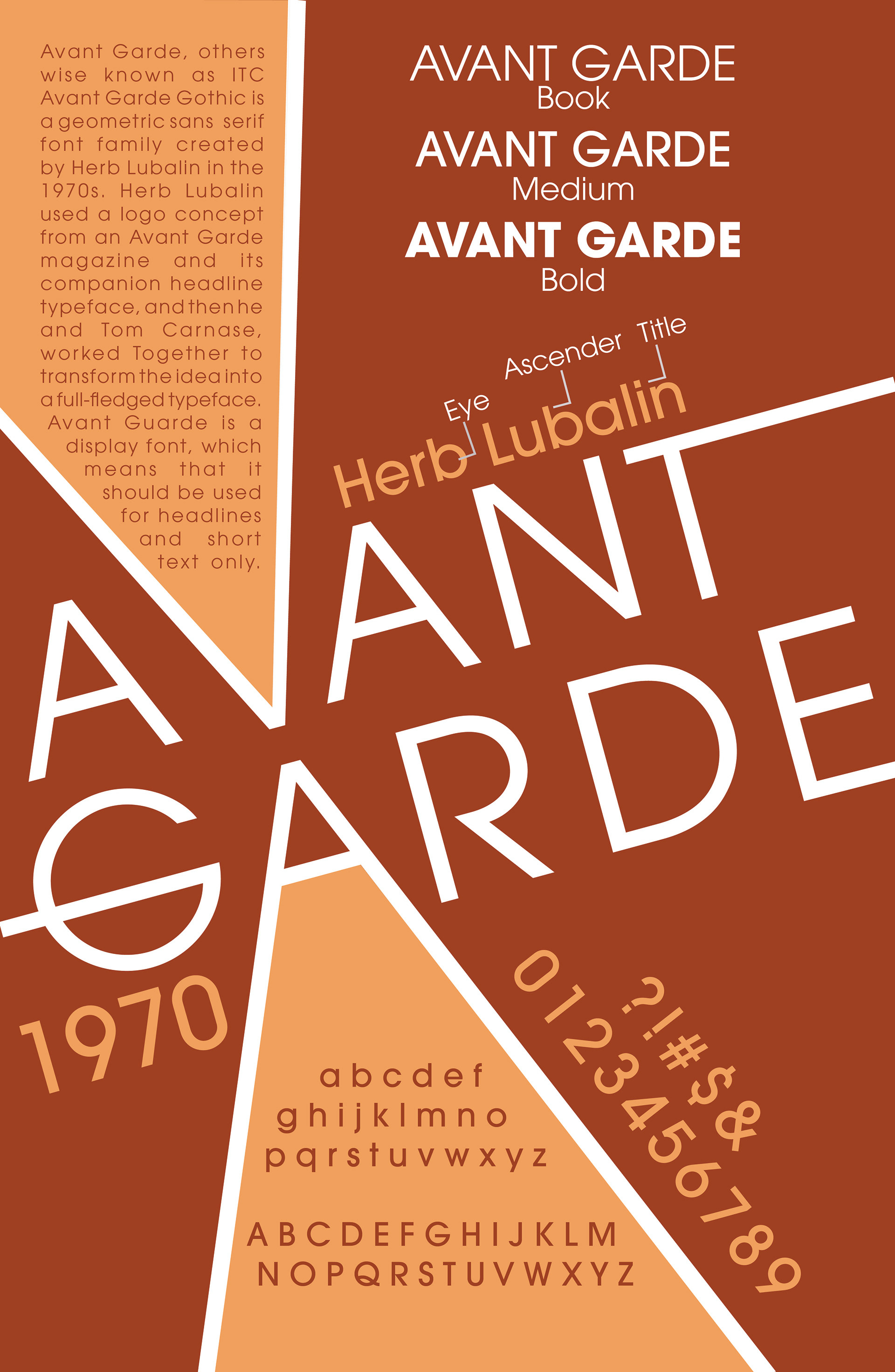
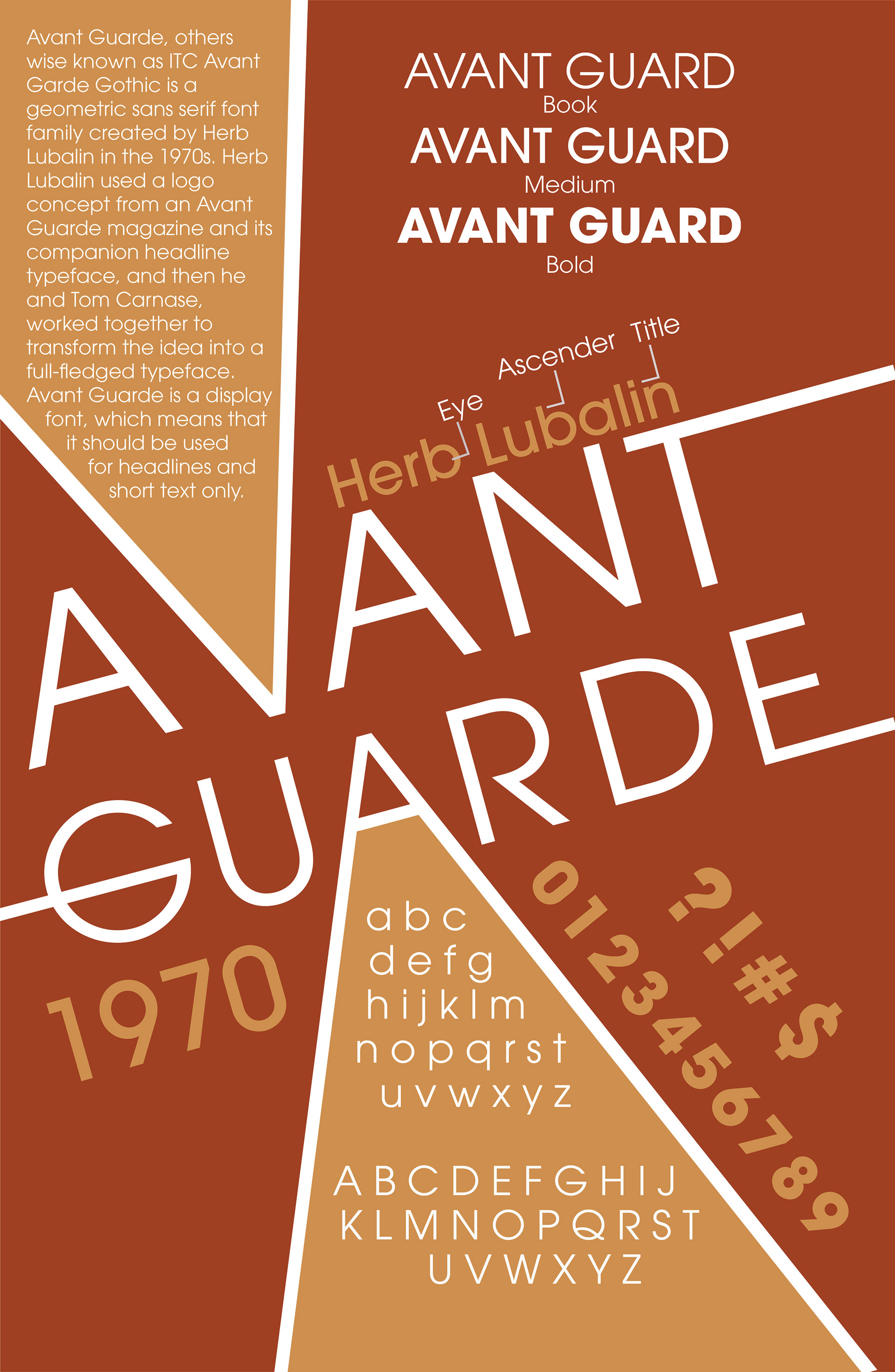
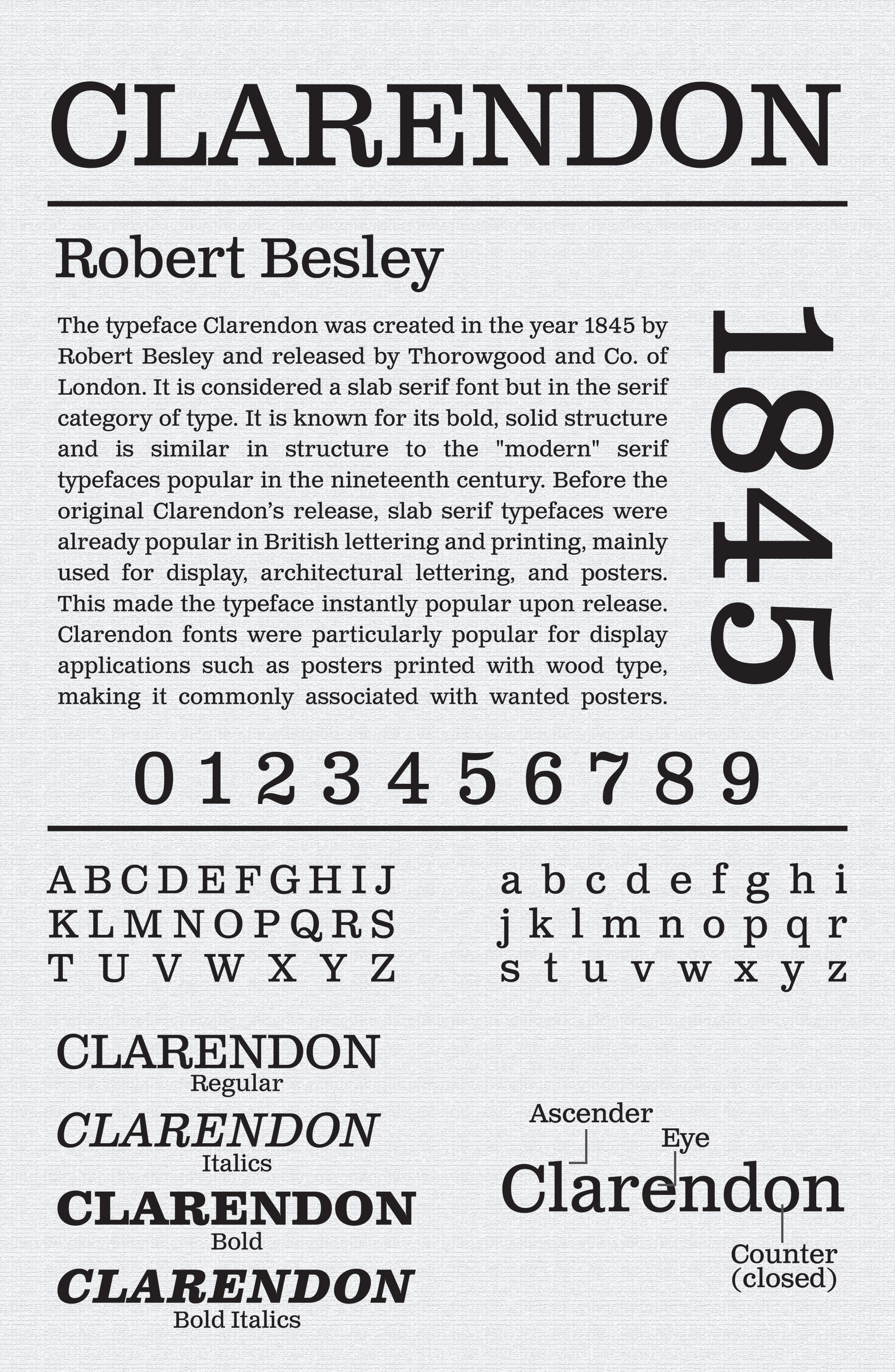
For this assignment, I was responsible for researching and designing two 11 x 17” posters for two given fonts that were completely different from one another. These posters had to give details about the fonts including include the date the font was created, the typographer’s full name along with the name of the font, a brief description, and the typographer’s history, 3 anatomy markers as well as the complete alphabet. One poster had to be done in color while the other had to be completely black and white.
STEP ONE: MOODBOARD
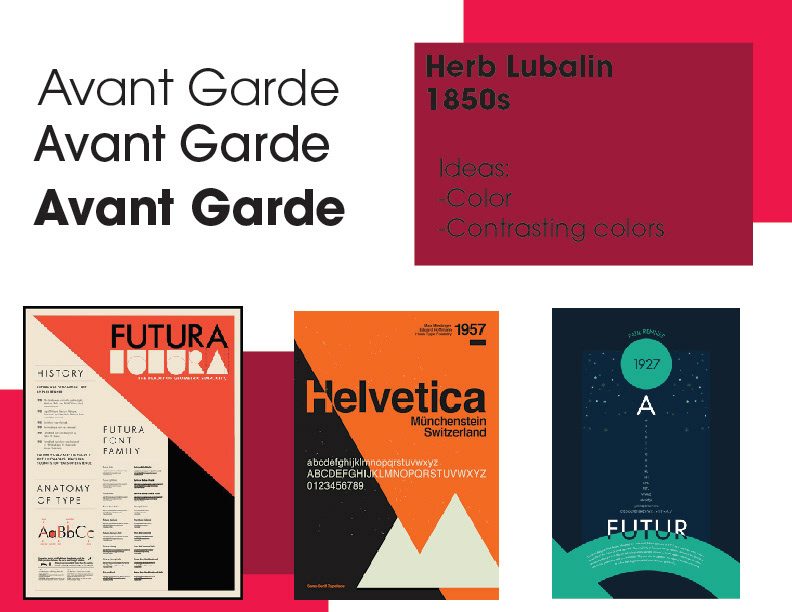
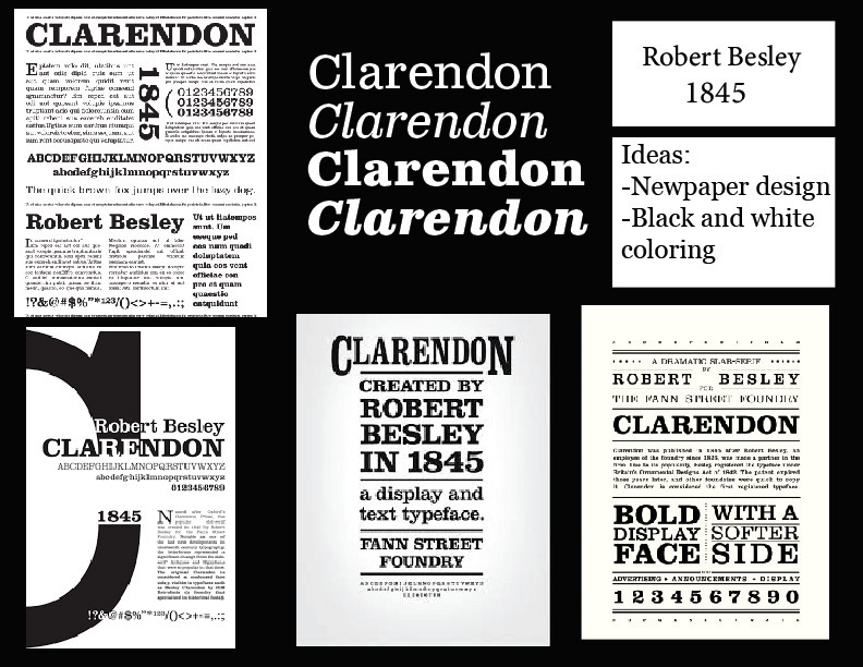
The first step to this process was putting together a moodboard. I collected a few different images that would convey the overall vibe I was looking to create for my posters. After a bit of thinking, I opted to make the Clarendon poster the black and white one as the font was once known to be used in newspapers, which would also explain the overall final look. For the Avant-Gard poster, I wanted to vibe to be more fun and colorful as it is a font that I tend to use for more fun projects.
STEP TWO: SKETCHES
The next step in this process was creating a few different thumbnail sketches for each of the posters. Basically, this step is used to help me get all my ideas out of my head and on paper to better understand the designs I am looking to create.
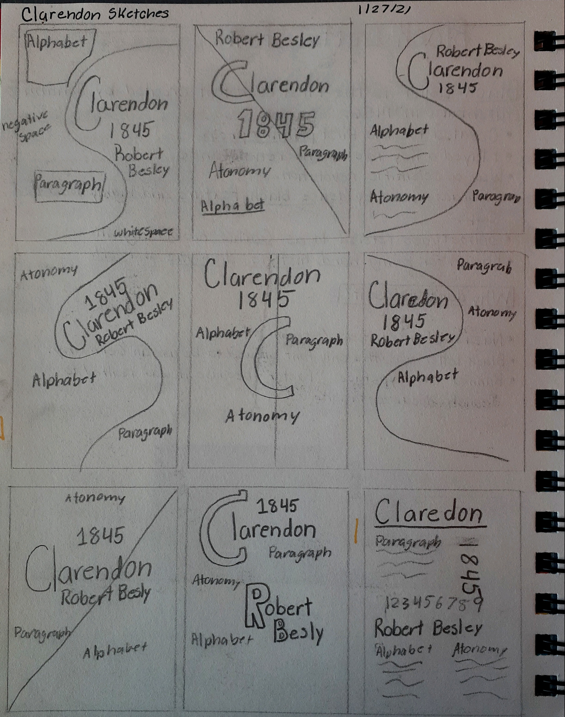
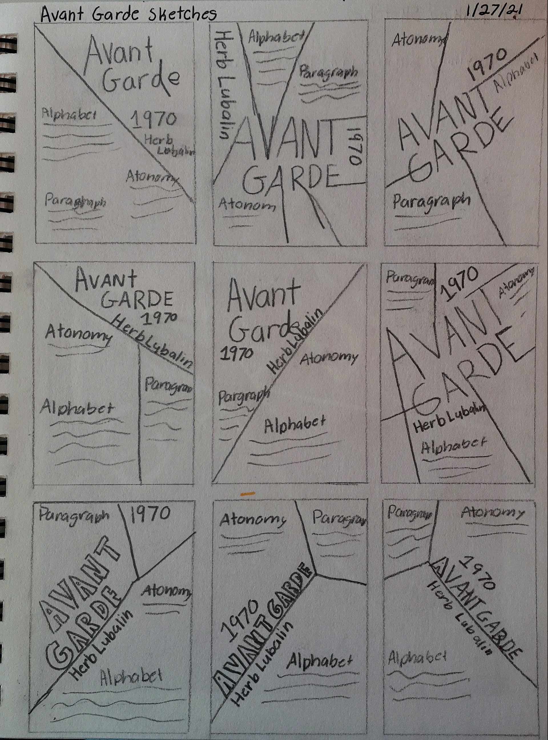
STEP THREE: REFIND SKETCHES
After creating a few thumbnail sketches, I then had the task of choosing the idea I liked best and creating a more refined drawing. This is where I started to add color and a bit more detail to the designs.
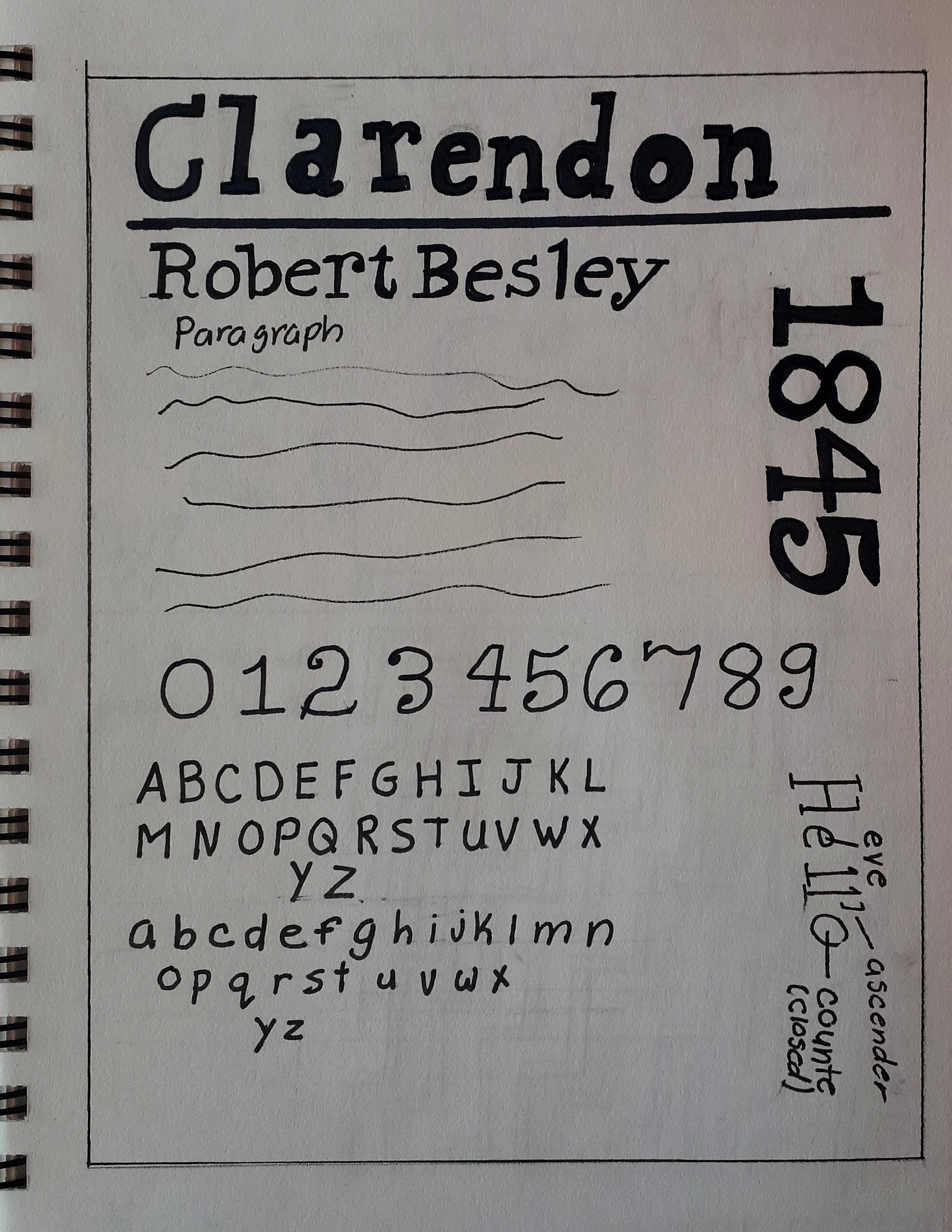
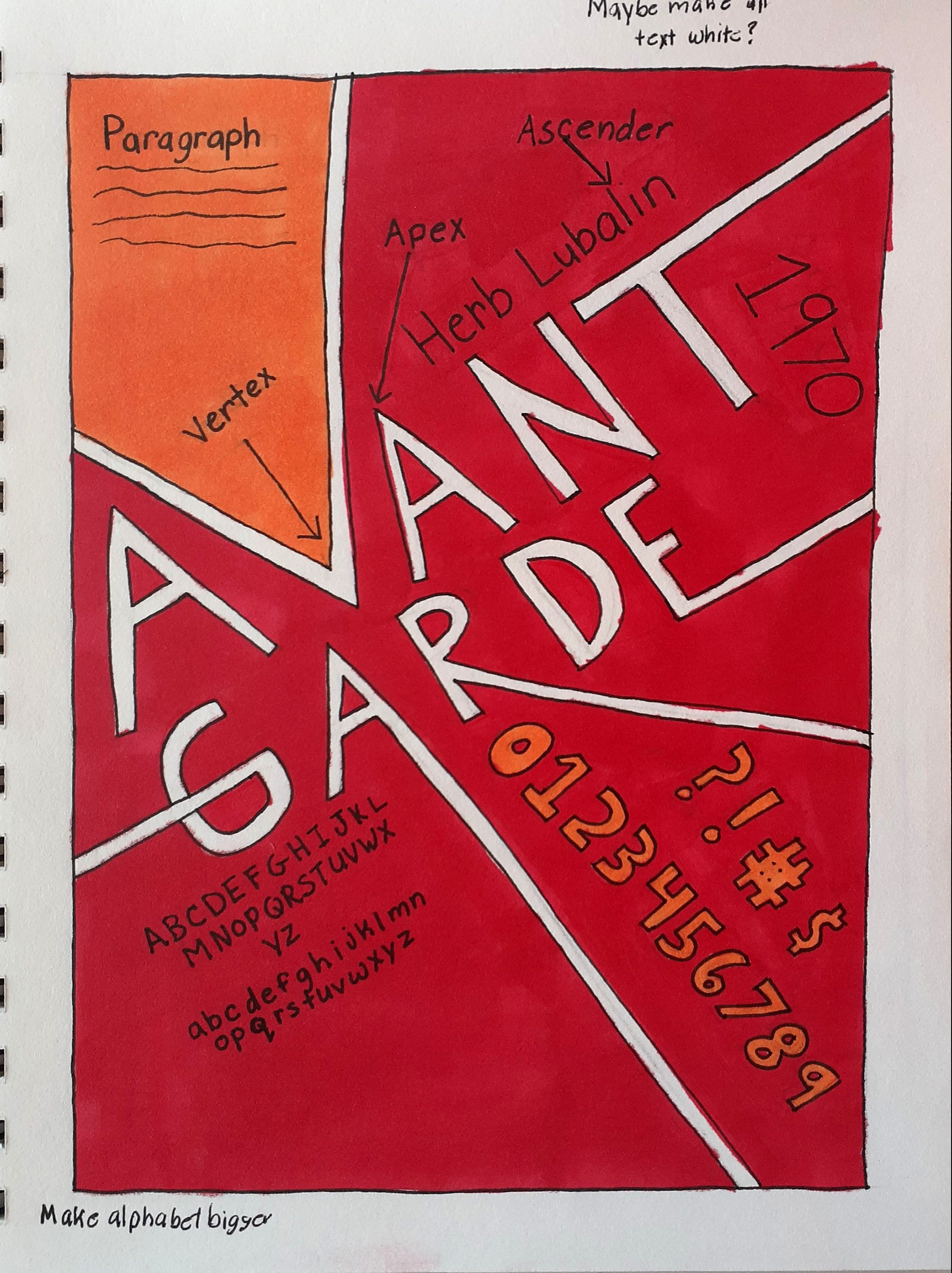
STEP FOUR: DIGITALIZING SKETCHES
After creating more refined sketches of my designs, the next step was to make these designs digital. Using Adobe Illustrator, I was able to begin my first round of designs and start creating them to look more professionally done.
STEP FIVE: CRITIQUES
Digitalizing these designs definitely elevated them and made the posters look way more put together. However, there was just a little bit more I could do to make them look even better.
STEP SIX: FINAL DRAFTS
