DESCRIPTION
I was responsible for creating a hypothetical company for a product, service, entertainment, or team. More specifically I had to create a brand identity package, a uniform design, a vehicle wrap, 2-3 company merch items, and one informational print that all follows the same brand standards.
STEP ONE: MOODBOARD
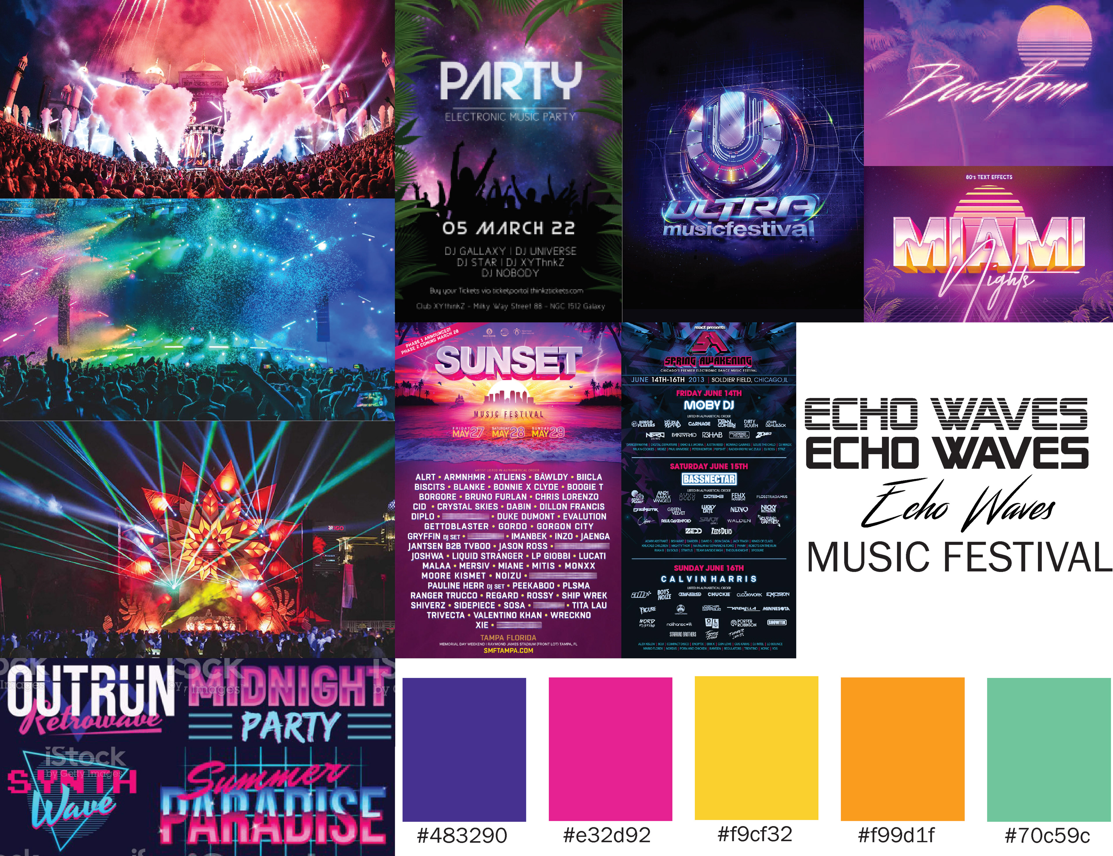
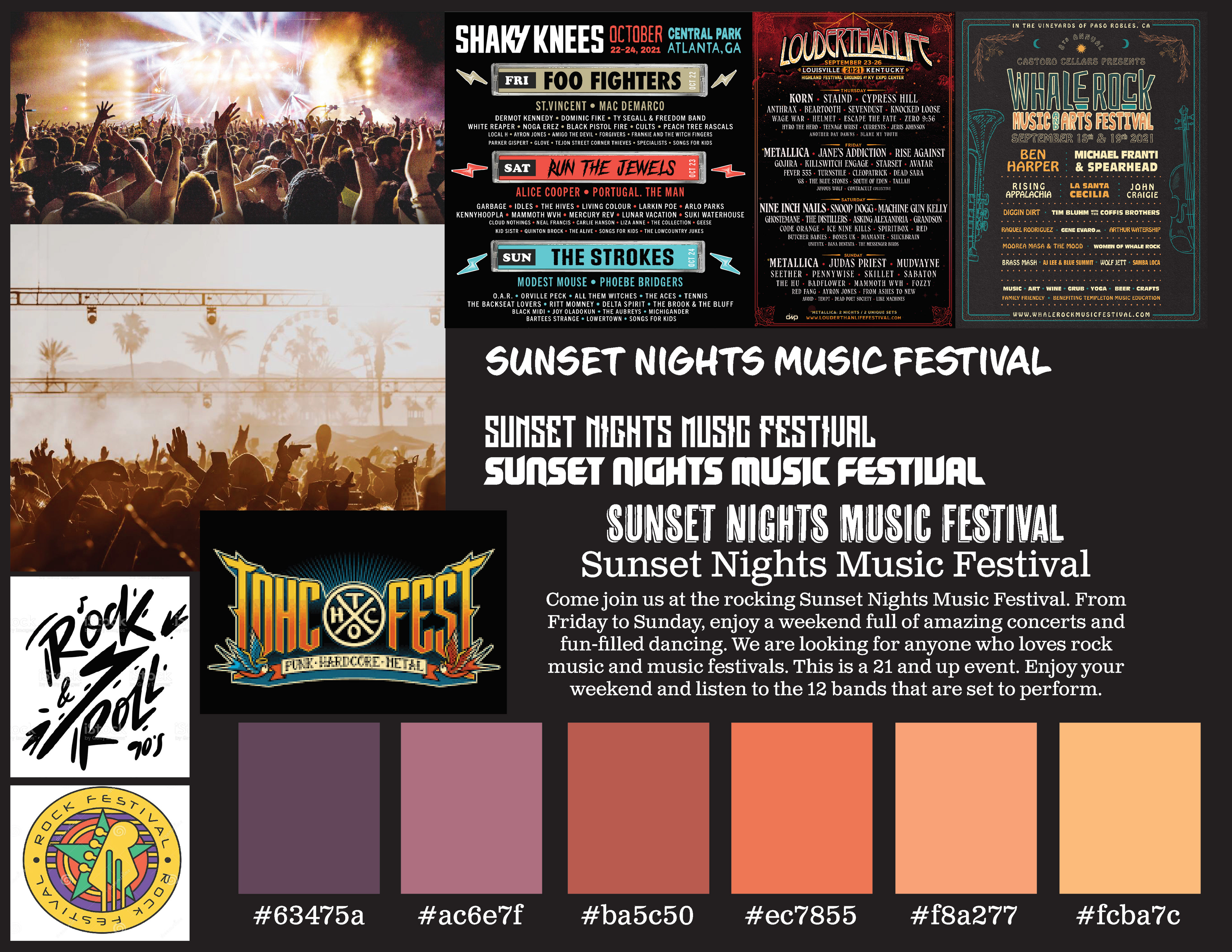
Like every other project, I had to start by creating a moodboard. This is where I put together a few different images and color palettes that would convey the overall aesthetic I am going for with this assignment. At the start, I couldn't decide if I wanted to make the festival a rock concert or an Electric concert so I created a moodboard for each style. However, I did know I wanted the brand to be called Sunset Nights.
After creating the moodboards I then decided that neither of the styles was what I wanted for the brand and I ended up focusing more on a rustic Indie style. To conclude the idea I ended up landing on was for a music festival that would be similar to Coachella, but had more of a focus on independent musicians.
STEP TWO: SKETCHES
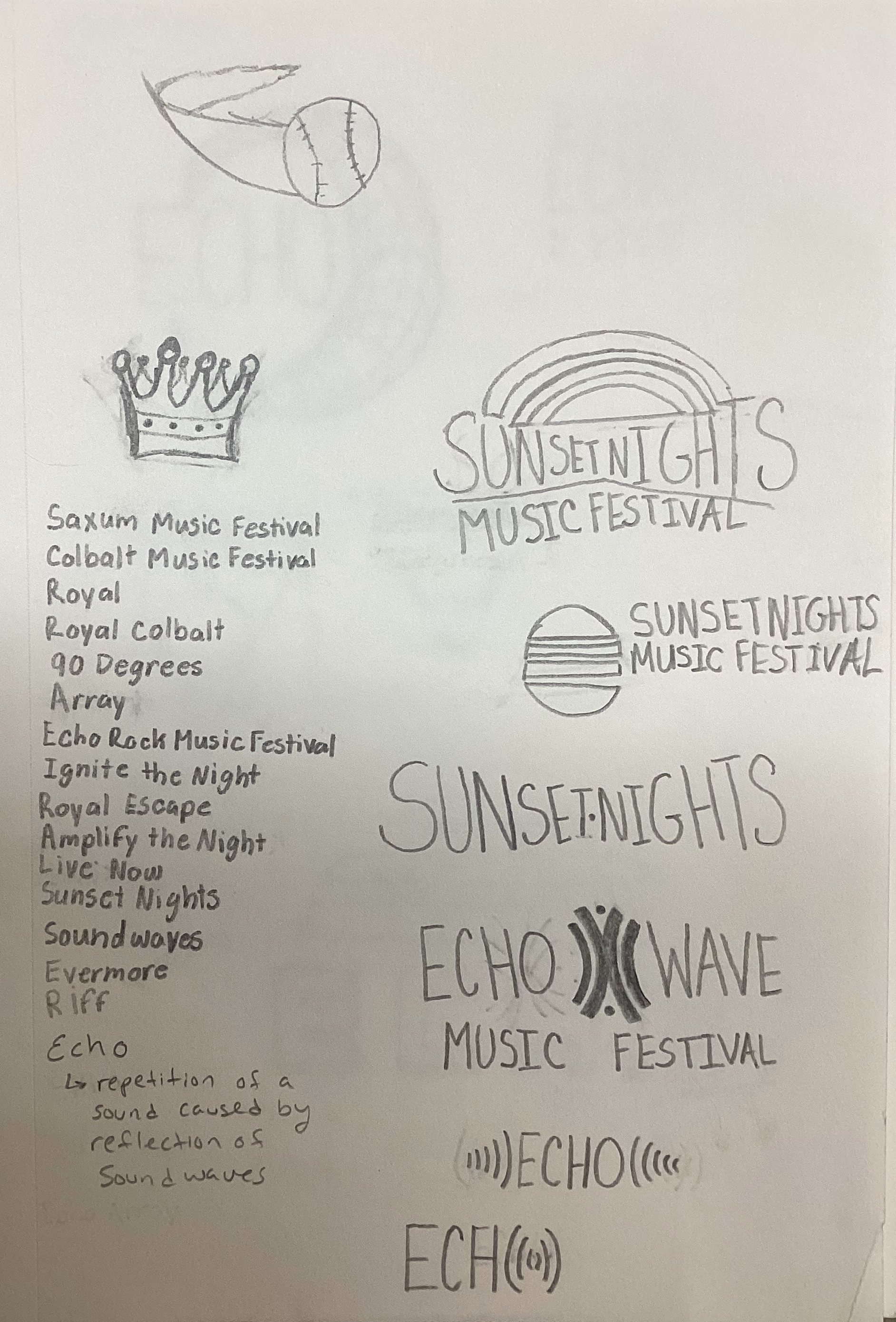
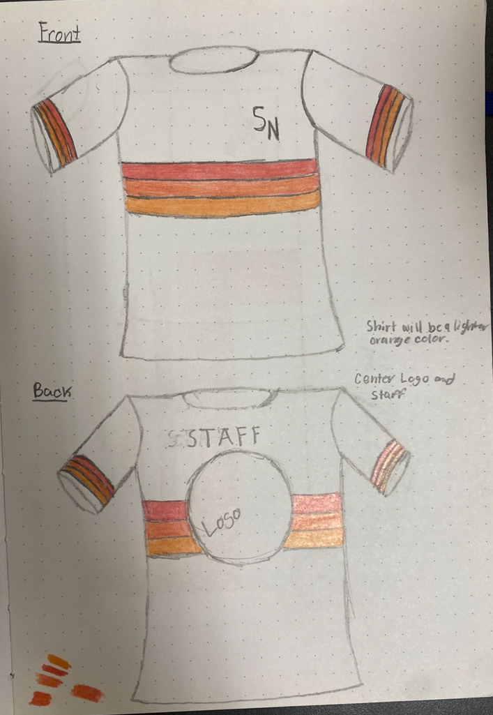
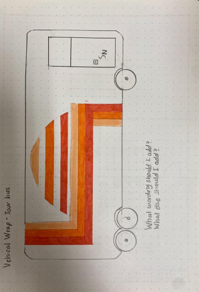
After creating a moodboard and understanding the direction I wanted to take with this, I started to create sketches for how I wanted the logo, t-shirt, and tour bus to look like.
PART THREE: FIRST ROUND OF LOGOS
Once my ideas were put down on paper, it was time to take these sketches and turn them digital by using Adobe Illustrator. I started off by making the logo using a more 'electric' style then moved to a more 'indie' style.
STEP FOUR: EDITS
After realizing the electric style wouldn't work the way I wanted I decided to go for a more indie style and create a badge logo with colors that mimicked a sunset.
STEP FIVE: FINAL LOGO
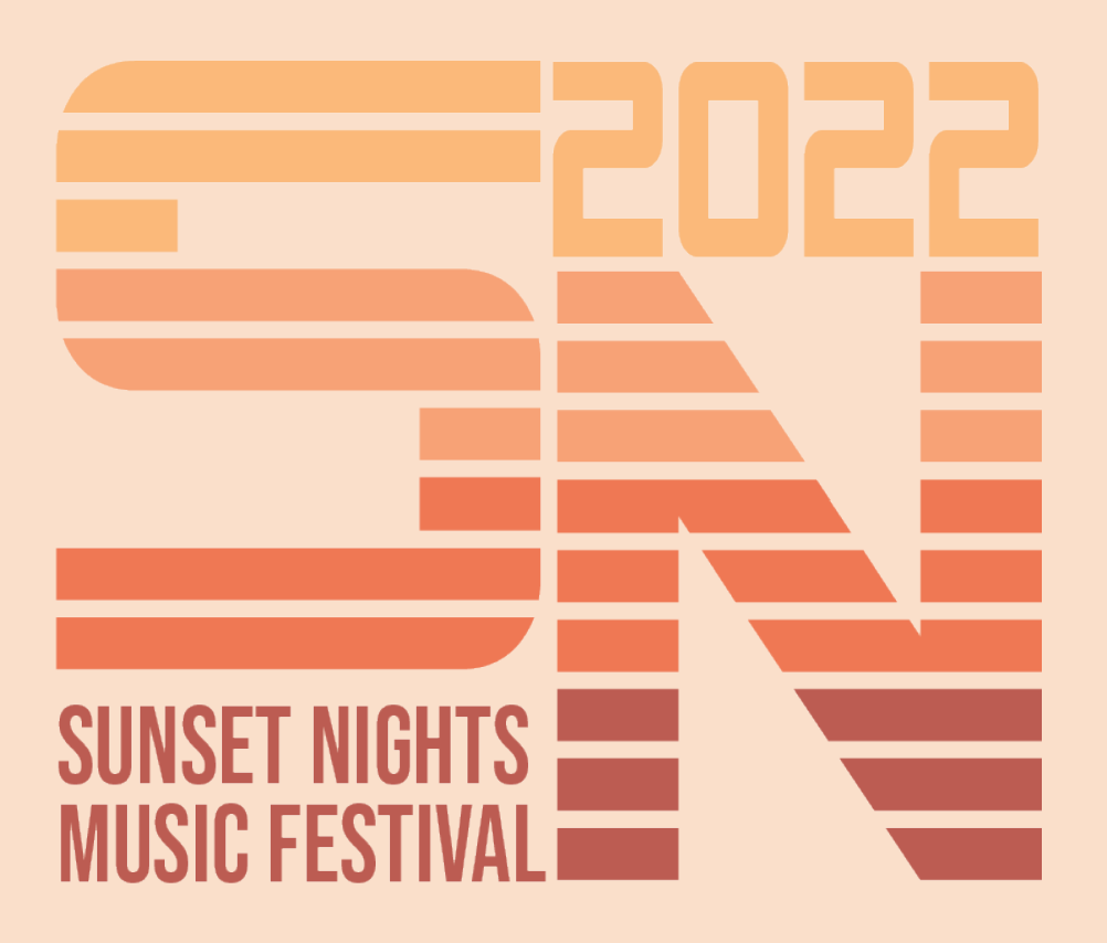
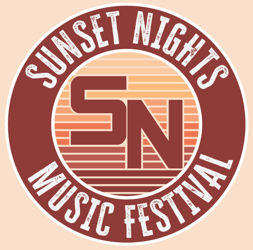
The proper edits had been made and I ended up with these two designs for my logo. The badge would be the main logo, being used on the uniform and tour bus, while the 'SN' would be used as more of a letter head.
STEP SIX: BRAND STANDARDS
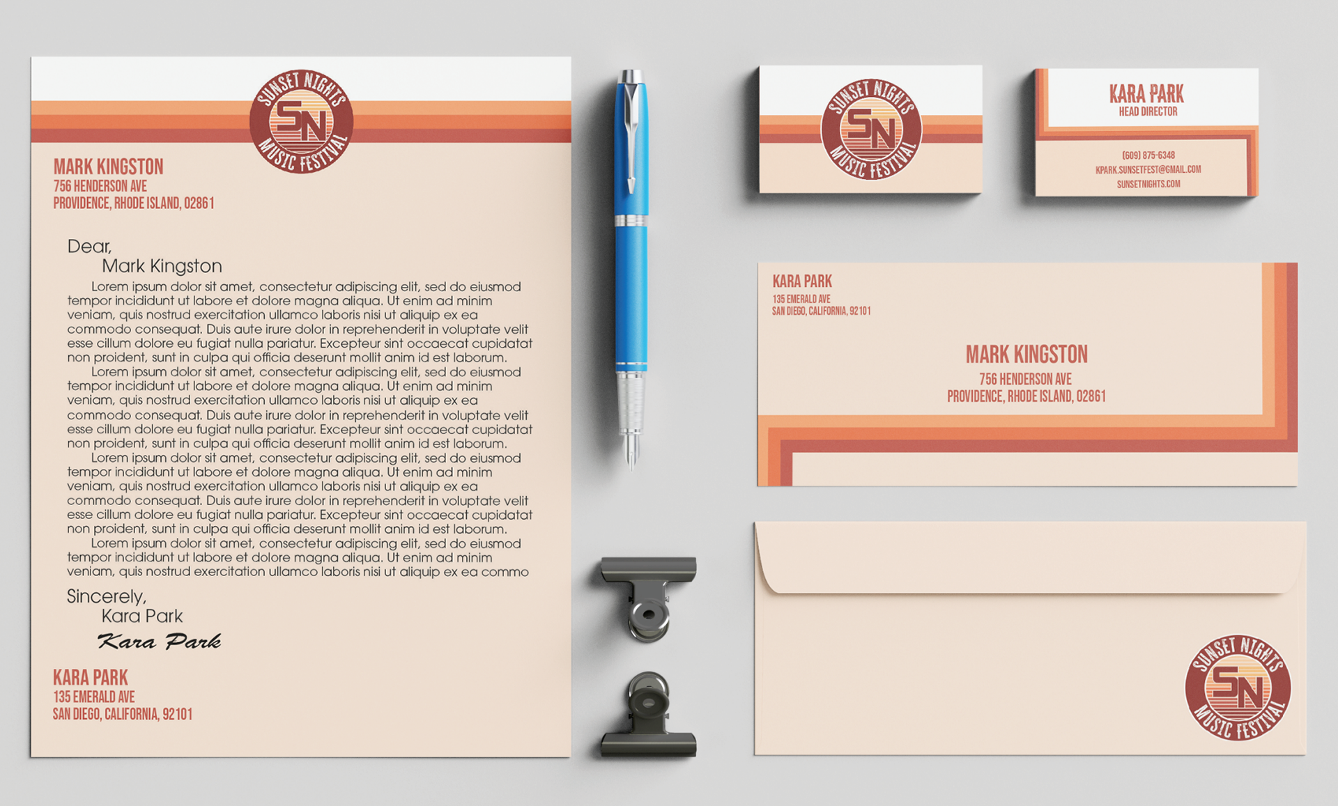
Once the logos were finished, the next step was creating a set of brand standards. How all the designs should look consistency-wise. I did this by creating a letter head, logo system, and a few other brand details.
STEP SEVEN: INFORMATIONAL PIECE
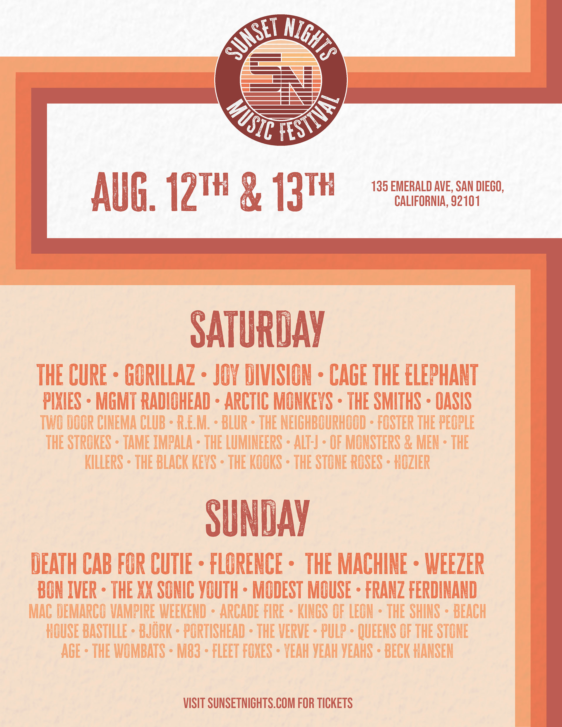
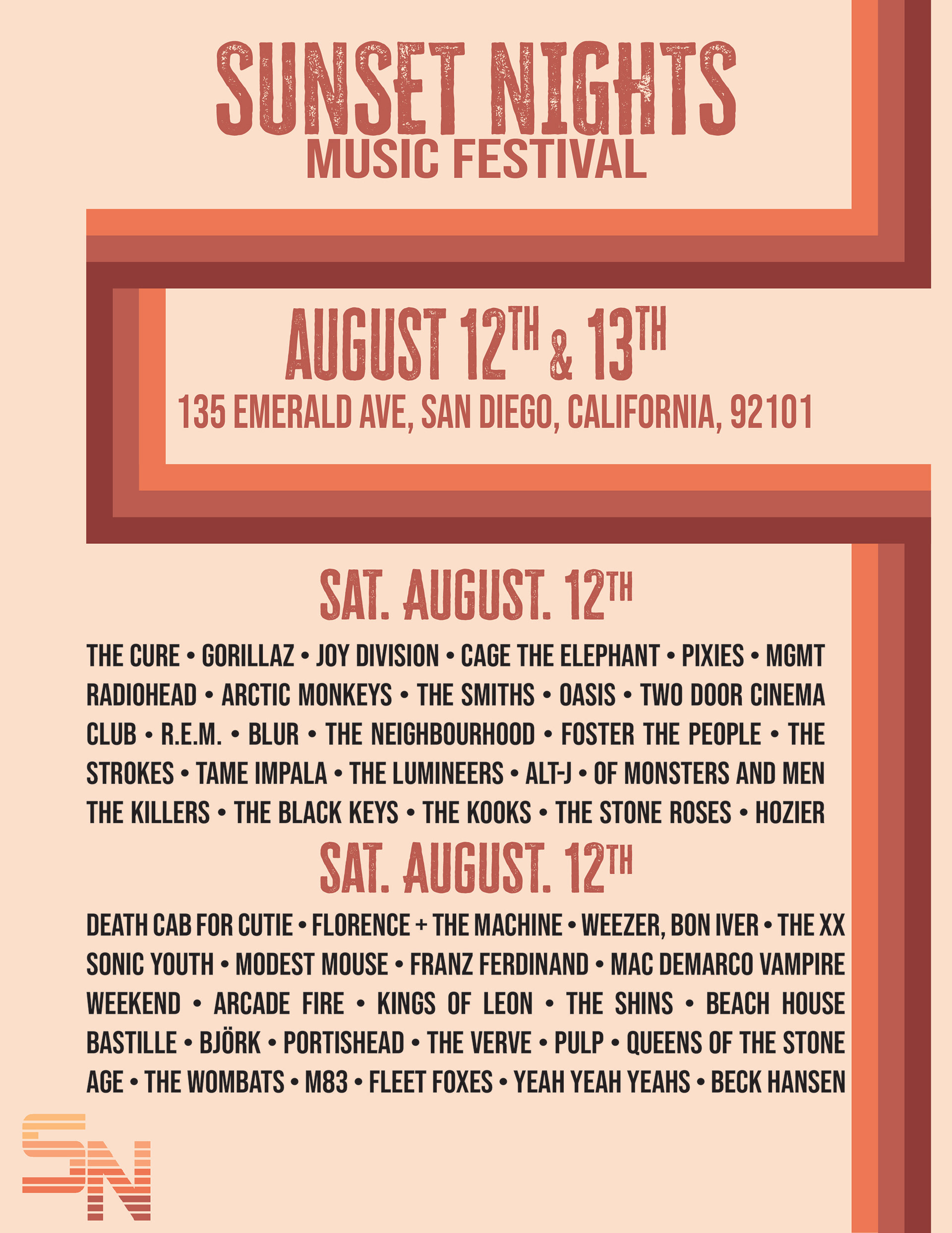
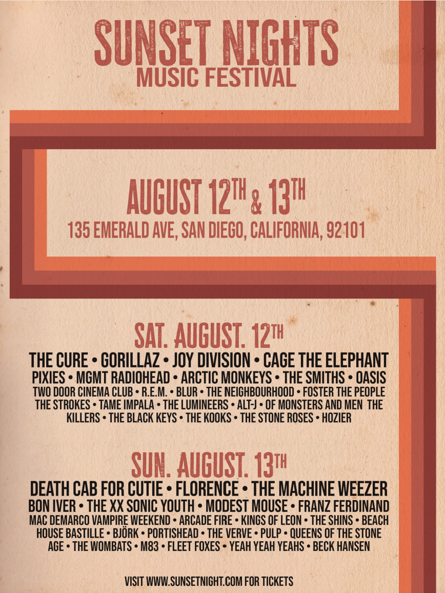
For the required informational piece, I decided the best design would be a flyer that had all the bands that would be performing that weekend. The schedule went through a few different phases until I ultimately landed on the final design.
STEP EIGHT: FINAL SCHEDULE
The final schedule design was edited to match the brand standards a lot more then it originally did. I mimicked the order of the colors in the logo, on the text that showed the headliners. I also played around with the font size and boldness to articulate to the viewer who the actual headliner was.
STEP NINE: UNIFORM DESIGNS
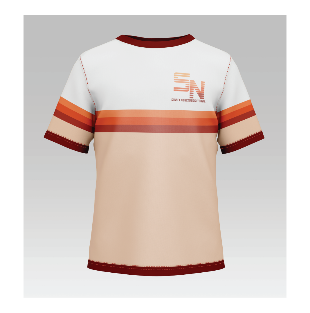
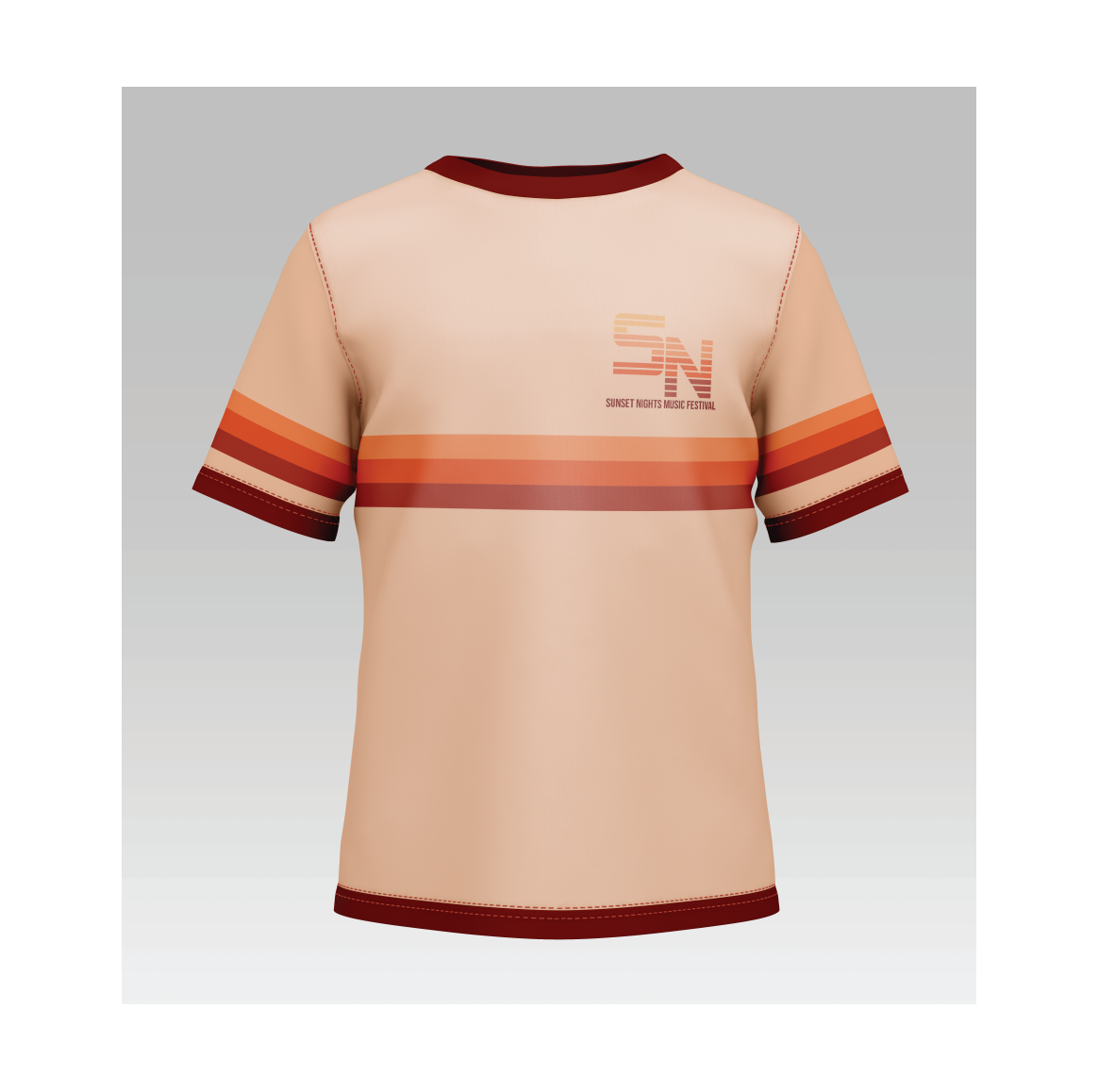
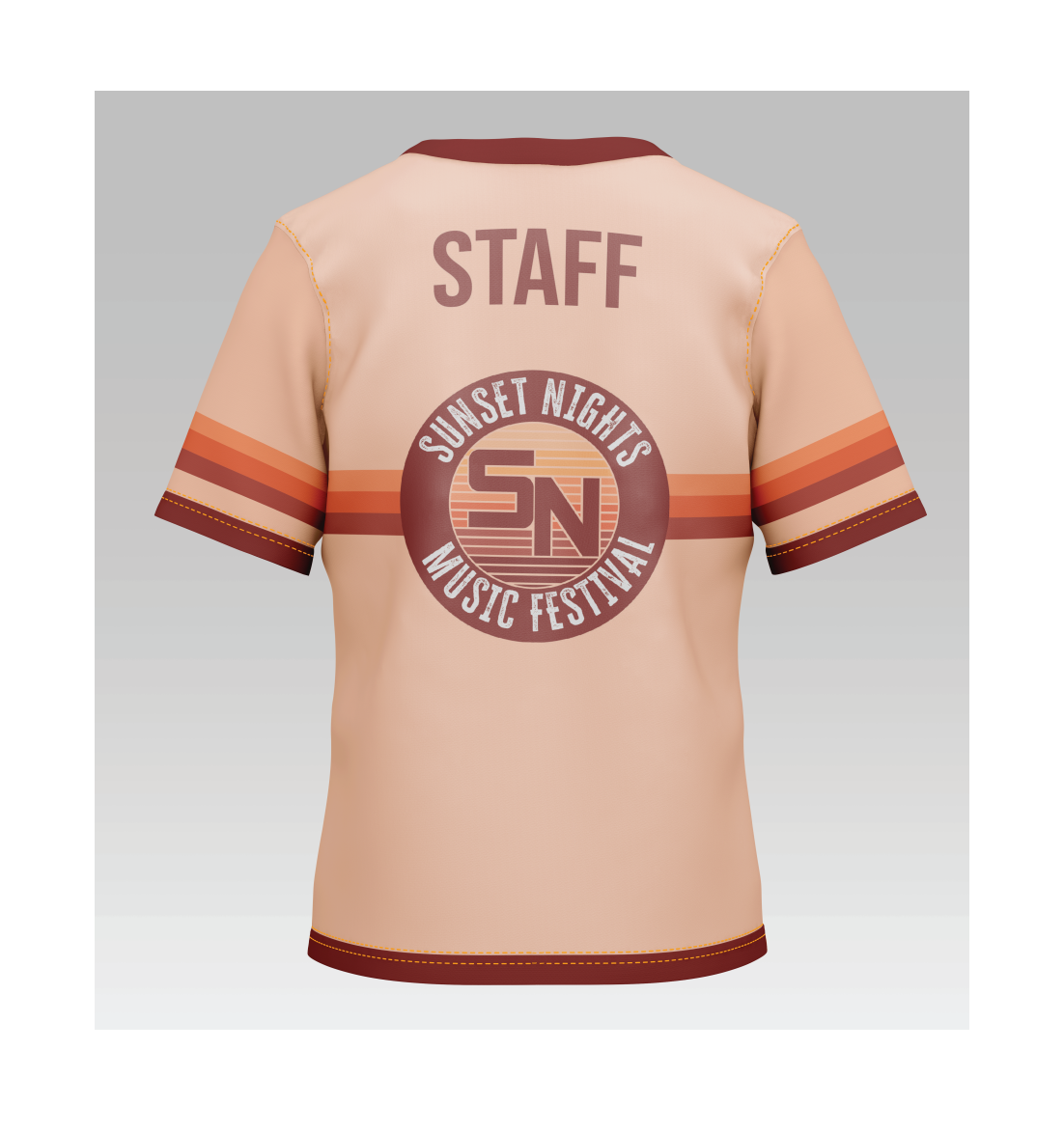
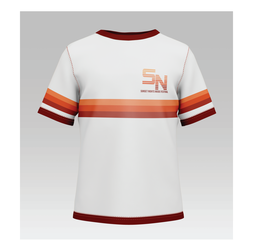
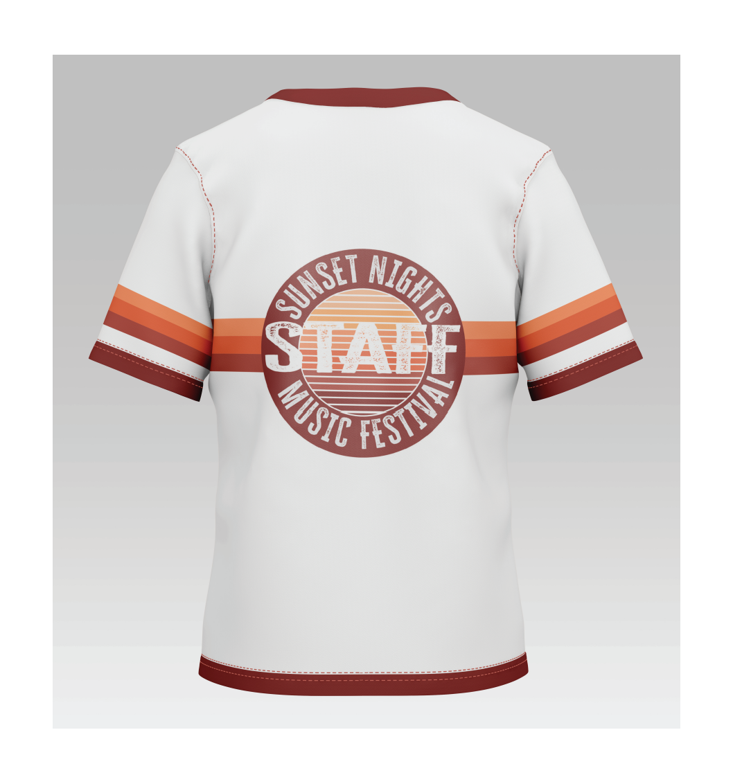
After creating the schedule it was time to create the uniform for the staff working the festival. Like the schedule, the design had a few different iterations before I landed on the final.
STEP TEN: FINAL UNIFORM
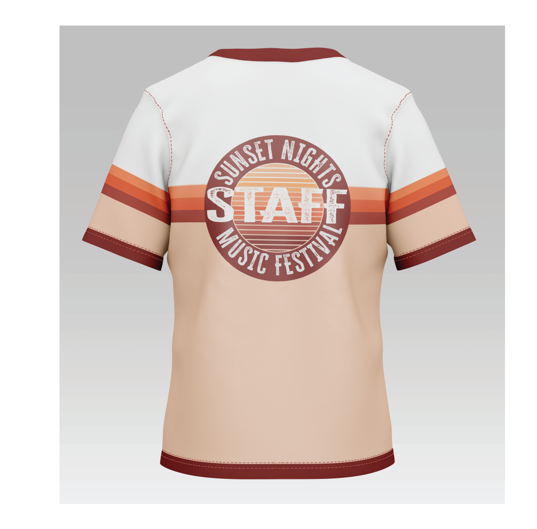
To keep with the brand standards that I had created, I continued with the line design splitting the color in half. Above the line was white while below was the light orange. This made the design consistent with the rest of the brand.

STEP ELEVEN: TOUR BUS DESIGNS
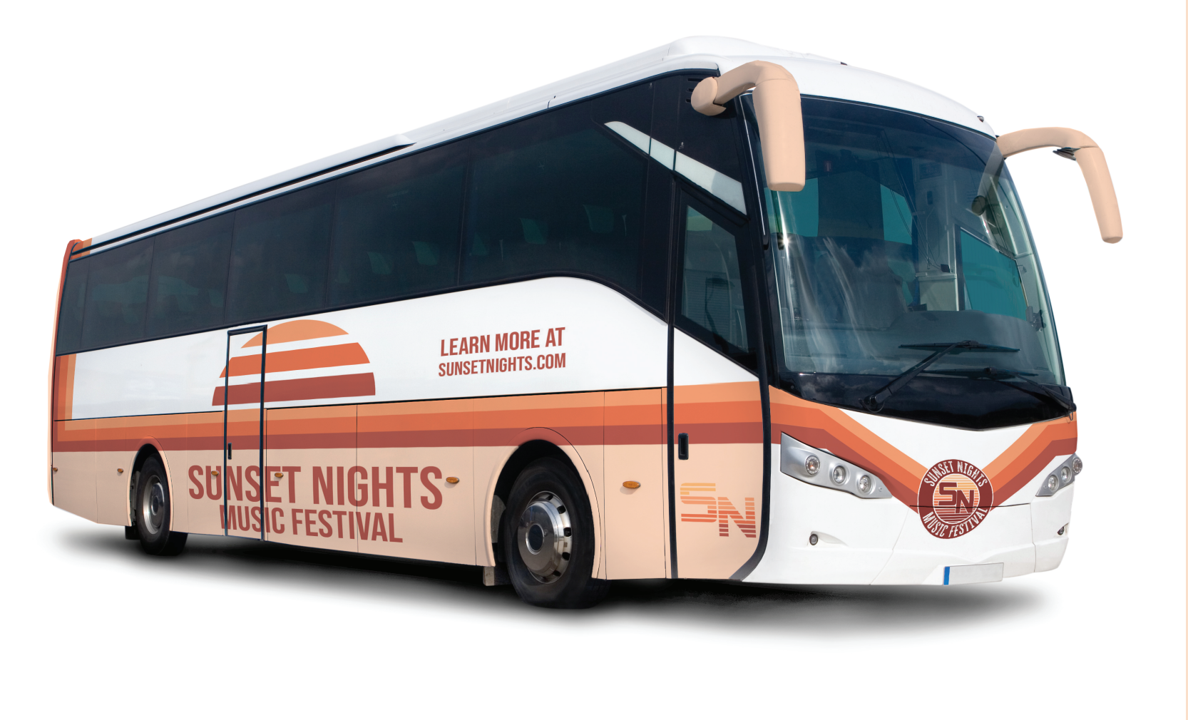
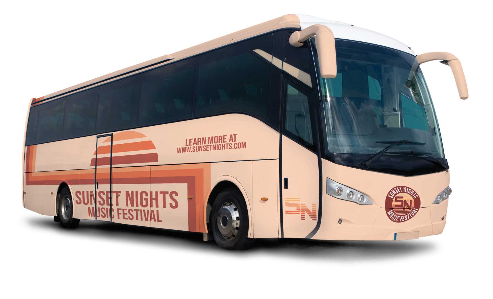
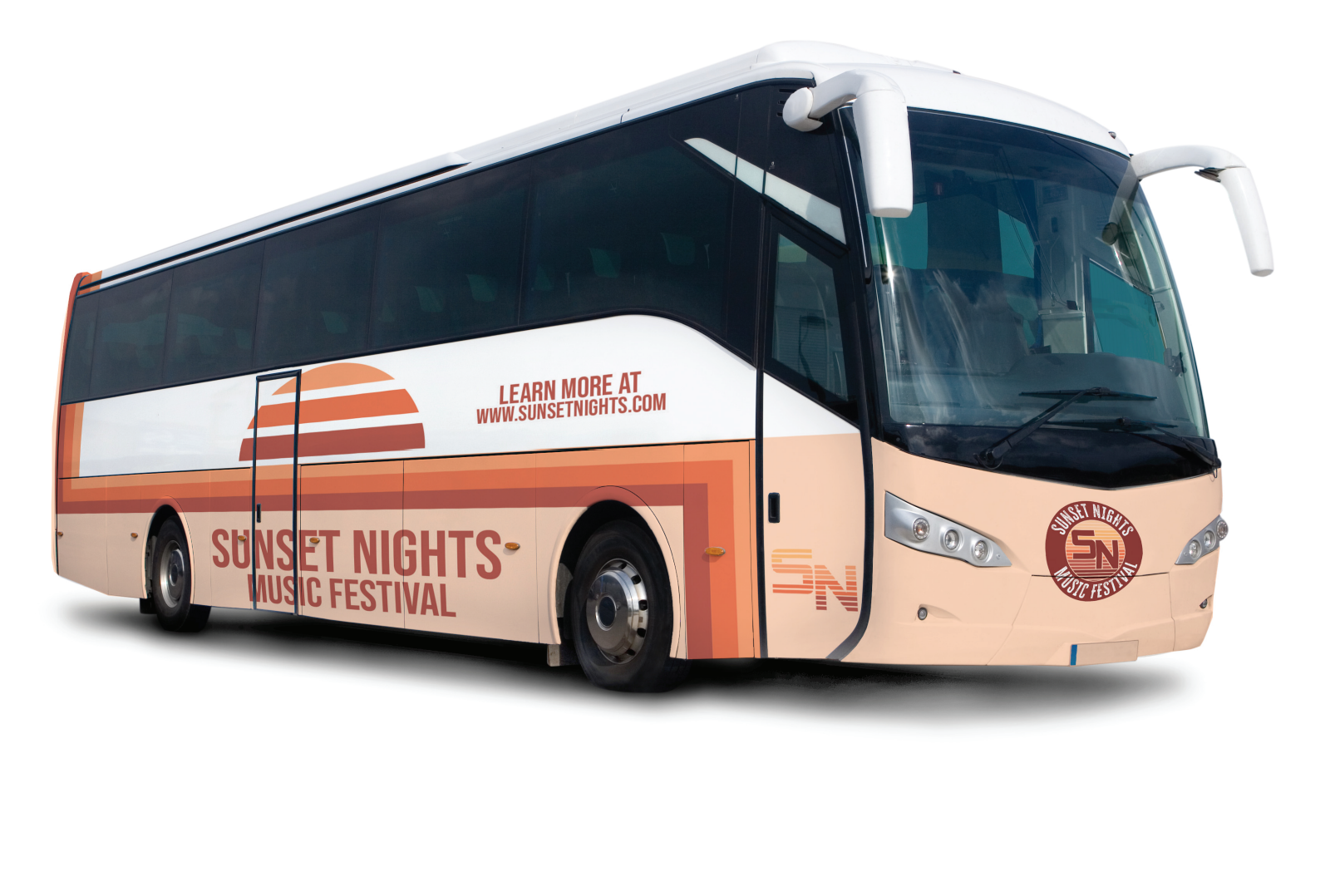
One of the requirements for this assignment was to create some kind of vehicle wrap for the brand. I figured with my brand being a music festival, the best design option was a tour bus that musicians could travel on.
STEP TWELVE: FINAL TOUR BUS
There wasn't much change between the first designs in the last. Except for the front of the final tour bus design changed to be more consistent with the rest of the brand standards.
STEP THIRTEEN: MERCH
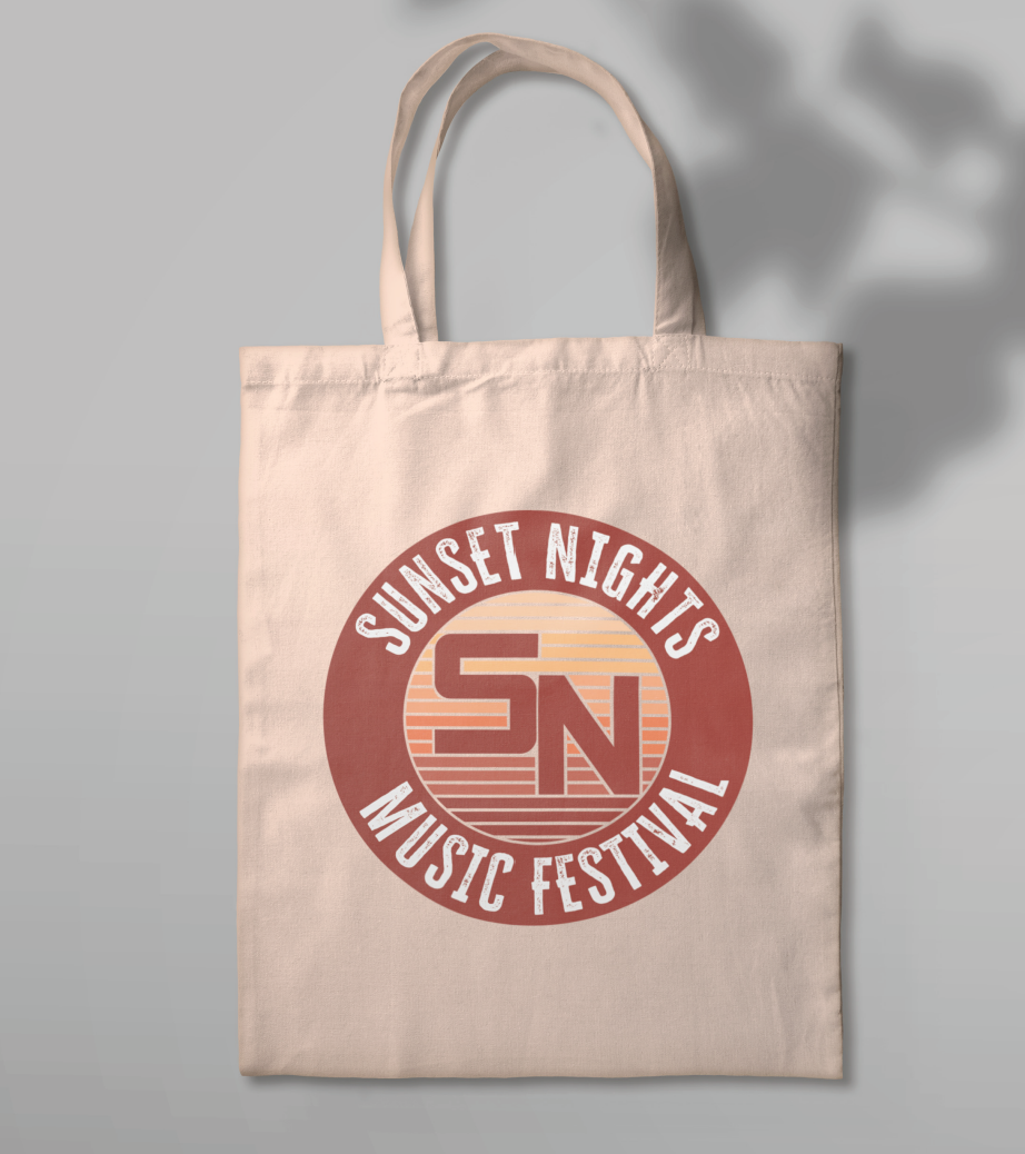
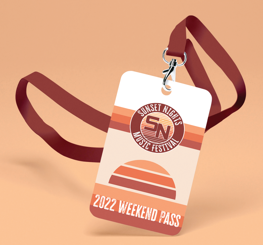
Creating the two pieces of merch was the final step in this process and was quite easy once I had a solid brand standard to follow. The lanyard was a simple idea as it could work as a pass and a piece of merch. The tote bag, I felt went really well as it was simple and easy to carry around with buyers.

FINALS
